Brand Identity · Figma · 2026
Smart, modern software solutions — with a loud visual signature.
Softure Software Solutions needed an identity that feels like engineering with personality: a modular mark built from connected angles, a neon-lime hero colour, and a flexible system that holds up across real applications — stickers, tote merch, and large-format outdoor. Built as a cohesive kit in Figma for fast rollout and consistent use.
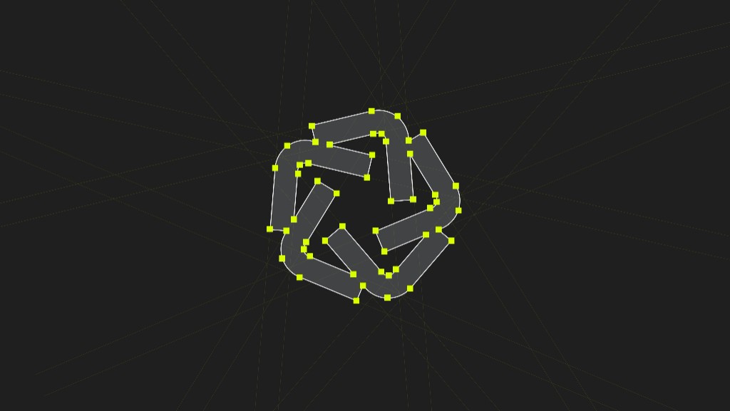
Mark geometry
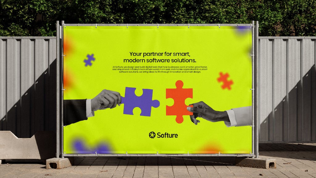
Outdoor
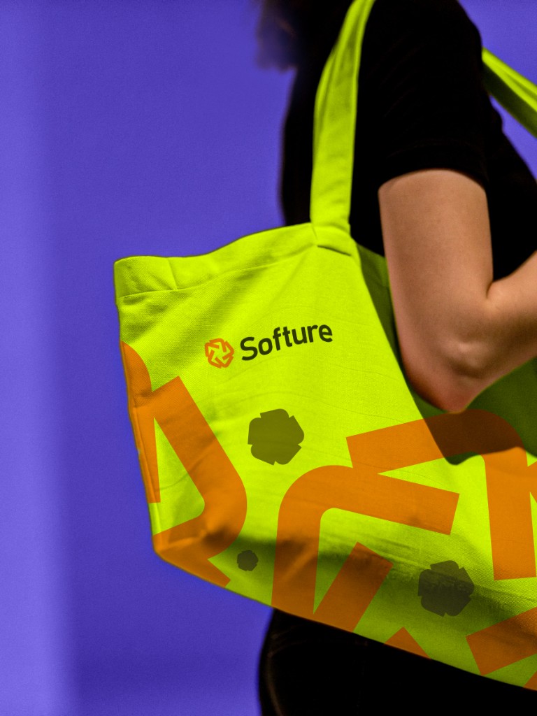
Merch
The Brief
Build a system that says “we ship” — but still feels human, modern, and memorable in a crowded tech space.
Softure is positioned as a partner for smart, modern software solutions, so the identity leans into a precise mark (constructed like a network) with an intentionally high-voltage colour story: lime as the hero, purple as depth, and orange as the spark.
Everything was assembled in Figma as a reusable kit: lockups, colour rules, spacing, and templates that keep outputs consistent — whether it’s a sticker on a laptop or a billboard on the street.
Inside the System
A practical brand kit: clear rules, flexible templates, and enough personality to stay recognisable at any scale.
Confident, partner-led copy that feels modern and direct. The brand sounds like a team that builds, not a brochure.
A geometric mark constructed from connected angles — designed to scale from icon to outdoor without losing its rhythm.
Lime as the hero, purple for depth, orange for impact — anchored by dark ink and ice highlights for readable UI and print.
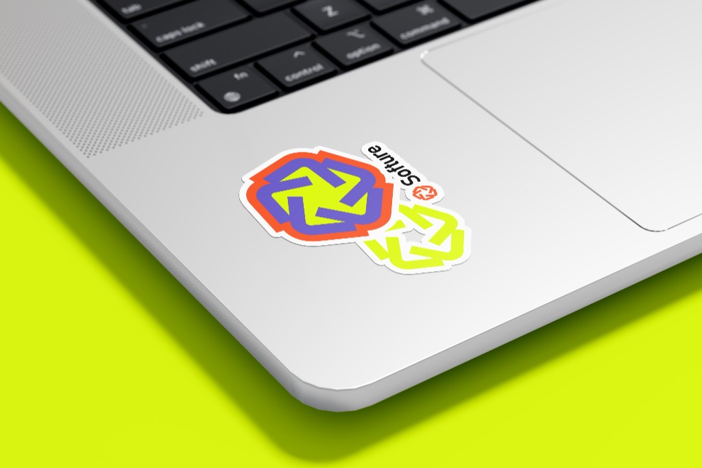
Real-world mockups to validate the system: sticker pack, tote merch, and high-visibility outdoor placements.
The Visual Language
A system designed to stay crisp under motion, scale, and real-world production constraints.
The symbol is a modular network of angled strokes — a visual shorthand for systems thinking, engineering, and collaboration. It can stand alone as an icon or pair with the wordmark for formal brand moments.
Neon lime creates instant recognition, balanced by purple and orange accents. Ink and ice keep typography legible on both bold and minimal layouts.
A display serif carries the brand’s confidence; the UI sans stays crisp in product layouts; the mono voice anchors specs, tokens, and technical details.
Applied
The system proving itself across surfaces — from personal devices to street-scale formats.
If you’re building a product, a studio, or a service business — I’ll design an identity system that looks sharp, scales cleanly, and stays consistent across every touchpoint.