Brand Identity · Guidelines · 2026
Urban, modern, movement-forward — built for real-world delivery.
Mecho Exit is a brand identity concept for a delivery-forward lifestyle: bold logotype, a geometric M mark with upward energy, and a five-colour system that balances deep navy with olive and lavender for digital and print. The full system was structured in Figma for consistency across social, packaging, and merchandise.
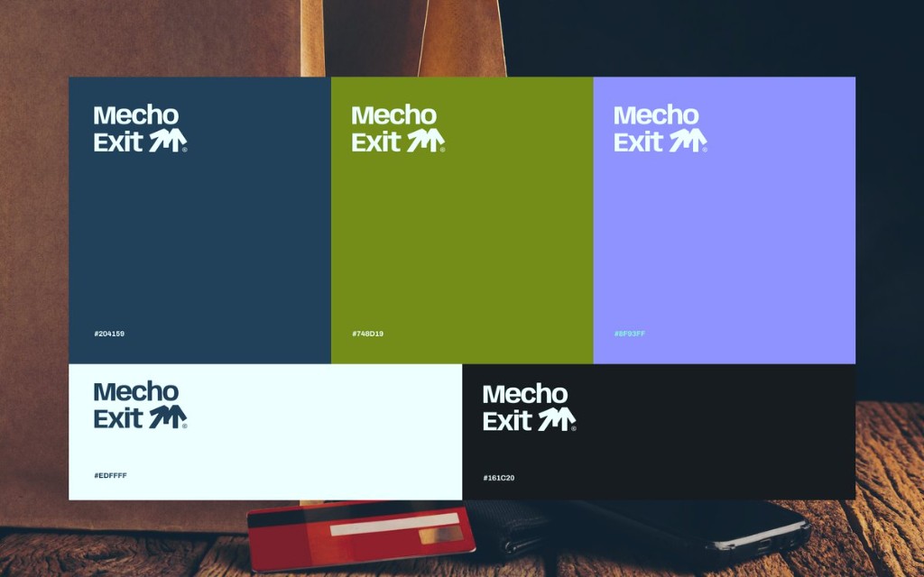
Logo grid
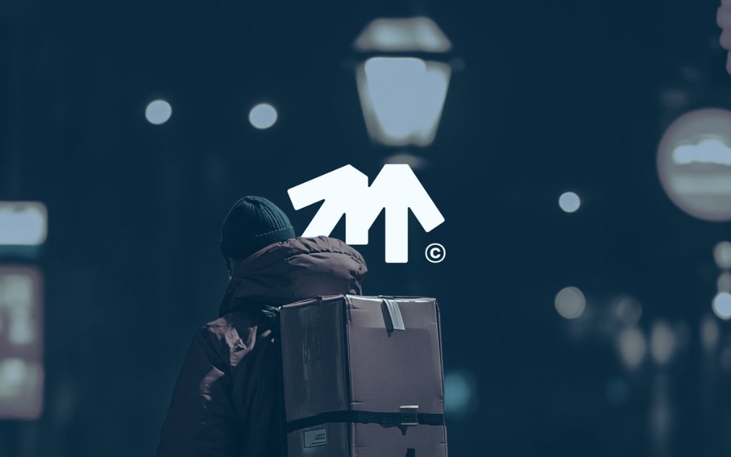
Hero
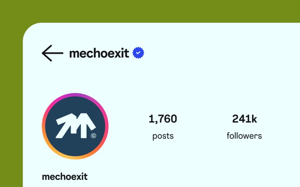
Social
The Brief
Mecho Exit asked for a brand that could scale — from a product icon tucked into a crowded home screen to a full-bleed web hero — without ever losing its signature.
The guidelines document codifies every decision that makes Mecho Exit recognisable: the construction of the mark, the way it breathes in layouts, the palette's hierarchy, and the typographic rhythm. It's a working reference — a source of truth — not a static showcase.
Built end-to-end in Figma — components, grids, and artboards that translate the mark into layouts, social templates, and merchandise. The deliverable is a system you can hand to any designer or vendor and expect the same Mecho Exit look on every surface.
Inside the System
The guidelines are organised around four pillars — each with clear rules, usage examples, and application notes.
Purpose, personality, and tone. Defines what Mecho Exit stands for and the voice it speaks with — so messaging stays cohesive across every channel.
Primary and secondary marks, clearspace, minimum sizes, and explicit do/don't examples. Built to stay legible from favicon to billboard.
A disciplined palette led by navy and olive, lifted with periwinkle and ice — plus charcoal for type. Pairings stay legible on night photography and on pale mint UI shells.
Applied examples across the web experience, the mobile app icon and UI, and social/print collateral — showing the system in the wild.
The Visual Language
The mark is a bold geometric “M” with strokes that lift toward an exit — upward energy without clutter. Paired with a tight wordmark when context allows; reduced to the glyph for favicons, profile icons, and stitched merchandise. Works at favicon scale and full-bleed hero.
The palette pairs deep navy with olive green, periwinkle lavender, ice highlights, and charcoal for typography — built for night scenes and light UI shells alike.
A display serif carries the emotional weight; a clean geometric sans does the work; a mono voice speaks in data and detail.
Applied
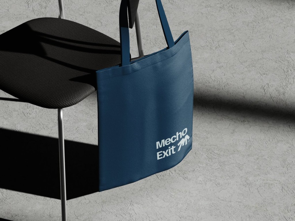
Mockups from the guidelines — hero photography, social presence, and a physical tote that proves the lockup in the real world.
Deliverable
Figma-ready artwork showing logo usage on the full Mecho Exit palette — for handoff to print and web.
If you're building a product, service, or studio — let's design an identity system that's beautiful, opinionated, and actually usable by the people around you.