UI/UX · Elite Youth Soccer · Figma · 2026
A coaching platform UI for weekly training plans, live roster intelligence, and a player-first weekly playbook.
The Kinetic Editorial is a UI/UX concept for professional football coaching operations: structured sessions in the Training Hub, a Field Report roster view for match readiness, and a light player experience for home practice. The visual system pairs deep navy surfaces with lime action states and restrained gold accents for wayfinding — designed end-to-end in Figma.
Login
Field report
Training hub
The Brief
Youth academies juggle weekly curriculum, match-day readiness, and parent communication — often across scattered spreadsheets and chat threads.
This concept unifies those threads into a cohesive surface language: structured training weeks, a roster-first Field Report, and a player home view that reduces cognitive load between sessions. Navigation, cards, and dense data tables share the same rhythm for coach and player modes.
Designed in Figma with responsive layouts, component libraries for cards and sidebars, and high-fidelity mockups for auth, dashboard, and drill detail flows.
Inside the Product
The experience is organised around coach workflows and player follow-through — each surface reuses the same card language and accent rules.
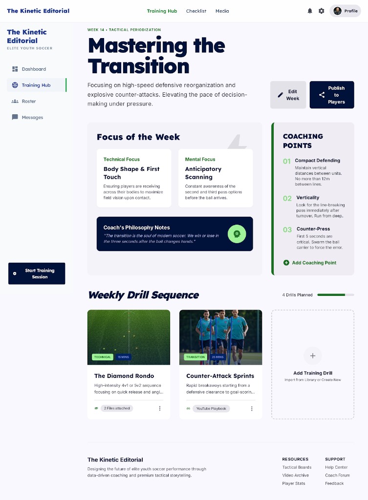
Session themes, technical and mental focus, coaching points, and a drill sequence with timing — the coach's weekly control centre.
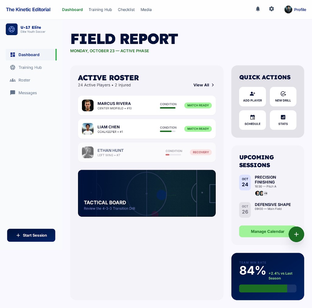
Roster table with condition bars, match-ready vs recovery states, tactical board preview, and upcoming sessions — ops at a glance.
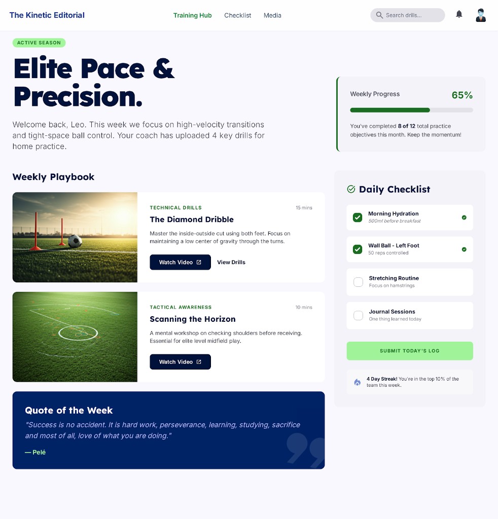
Hero copy for the active season, drill cards with watch CTAs, progress and daily checklist — built for clarity on repeat visits.
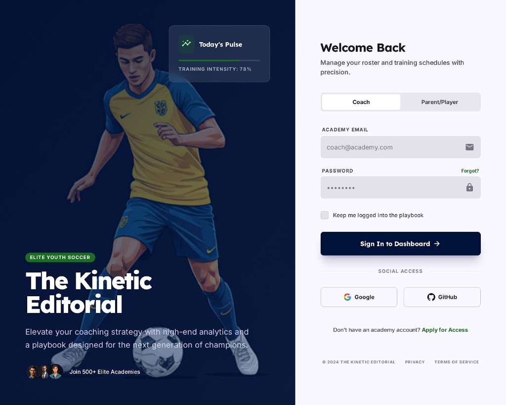
Split sign-in for coach vs parent/player, academy email fields, and social access patterns — framed with brand illustration on the left rail.
The Visual Language
Top navigation centres wayfinding; sidebars stay light grey for scan-ability. Active destinations use lime — sparingly — for focus, status pills, and primary calls to action. Cards float on paper-toned neutrals with consistent corner radii.
Deep navy anchors navigation and data-heavy regions; lime signals momentum (active links, progress, CTAs). Soft greys separate modules without fighting the brand.
Headlines use a bold geometric sans for dashboard impact; body copy stays neutral and high-contrast on light shells. Mono labels echo tactical board callouts.
Screens
High-fidelity mockups covering the player weekly playbook and the coach Field Report — same grid, different density.
Access
Full-width Figma frame for the split login — illustration and “Today's Pulse” widget on the left, form and social access on the right.
If you're shaping a coaching tool, analytics surface, or training workflow — let's craft interfaces that hold up under real match-week pressure.