Work / UI/UX Design / Clario

UI/UX · Created with Figma · 2026

Clario.

A finance toolkit landing experience — bold, calm, and conversion-driven.

Clario is a UI/UX concept for an all-in-one finance toolkit. The goal was a landing experience that feels premium and reassuring — with a dark foundation, neon-green highlights, and depth-rich cards that guide the eye from value proposition to proof and content. Built as a complete page system in Figma before handoff.
Clario primary logo mark How it works
Clario website mockup Hero
Clario mobile app icon Blog
Project
AI Blog
Scope
UI/UX Case Study
Tool
Figma
Focus
Clarity
Premium dark UI
Neon accent
Card depth
Landing hierarchy
Conversion UX
Content system
Blog preview
Motion-ready
Premium dark UI
Neon accent
Card depth
Landing hierarchy
Conversion UX
Content system
Blog preview
Motion-ready

React Native · In Development · 2026

A system,
not a logo.

Clario asked for a brand that could scale — from a product icon tucked into a crowded home screen to a full-bleed web hero — without ever losing its signature.

The experience is built around three loops: (1) capture spending fast (manual or receipt scan), (2) stay aware through dashboards and trends, and (3) adjust with AI-driven explanations and nudges that feel human.

Before implementation, I designed the full UI/UX system in Figma so interaction patterns and hierarchy were locked in early. That reduces churn during development and keeps the product coherent as features expand.

31
pages of defined brand rules & applied examples
4
core pillars — mark, palette, type, voice
2
platforms covered — web & native mobile
1
unmistakable visual identity system

React Native · In Development · 2026

Four disciplines.
One identity.

The guidelines are organised around four pillars — each with clear rules, usage examples, and application notes.

01 / Foundations

Brand Story
& Positioning

Purpose, personality, and tone. Defines what Clario stands for and the voice it speaks with — so messaging stays cohesive across every channel.

Purpose Voice Values
02 / Mark

Logo
Construction

Primary and secondary marks, clearspace, minimum sizes, and explicit do/don't examples. Built to stay legible from favicon to billboard.

Primary App Icon Clearspace
03 / Palette & Type

Color
& Typography

A deliberate palette led by crimson, anchored with deep ink and soft cream. Type pairings that balance confidence with readability on any surface.

Hex / RGB Hierarchy Pairing
04 / Applications

Web,
App & Print

Applied examples across the web experience, the mobile app icon and UI, and social/print collateral — showing the system in the wild.

Web iOS / Android Social

React Native · In Development · 2026

Mark. Palette.
Typography.

01 — The Mark

A hexagonal crest
with an upward arrow.

The mark is built from a crimson hexagon — a shape that suggests structure and alignment — pierced by a rising blue triangle. It reads as motion, direction, and balance all at once. Works equally at 16px and billboard scale.

Clario logo mark
02 — The Palette

Crimson-led,
ink-grounded.

Clario's palette is anchored by a confident crimson, balanced by deep ink and a soft cream. A deep-green accent adds calm and depth to long-form layouts.

#C8103D
#8F0B2B
#0B0B0B
#EDE8E0
#0A0A0A
Tint
Tint
Paper
03 — Typography

Editorial &
functional.

A display serif carries the emotional weight; a clean geometric sans does the work; a mono voice speaks in data and detail.

Clario.
Display · Serif
Section heading in UI
Interface · Sans
01 — PRIMARY MARK / CLEARSPACE
Labels · Mono

React Native · In Development · 2026

In the
wild.

Key screens from the UI system — showing the product across capture, budgeting, and analysis flows.

Clario website browser mockup on crimson background
Hero Browser & product surface
Clario mobile app icon on a phone home screen
Blog iOS home screen treatment

UI / UX

Designed for clarity.
Built for trust.

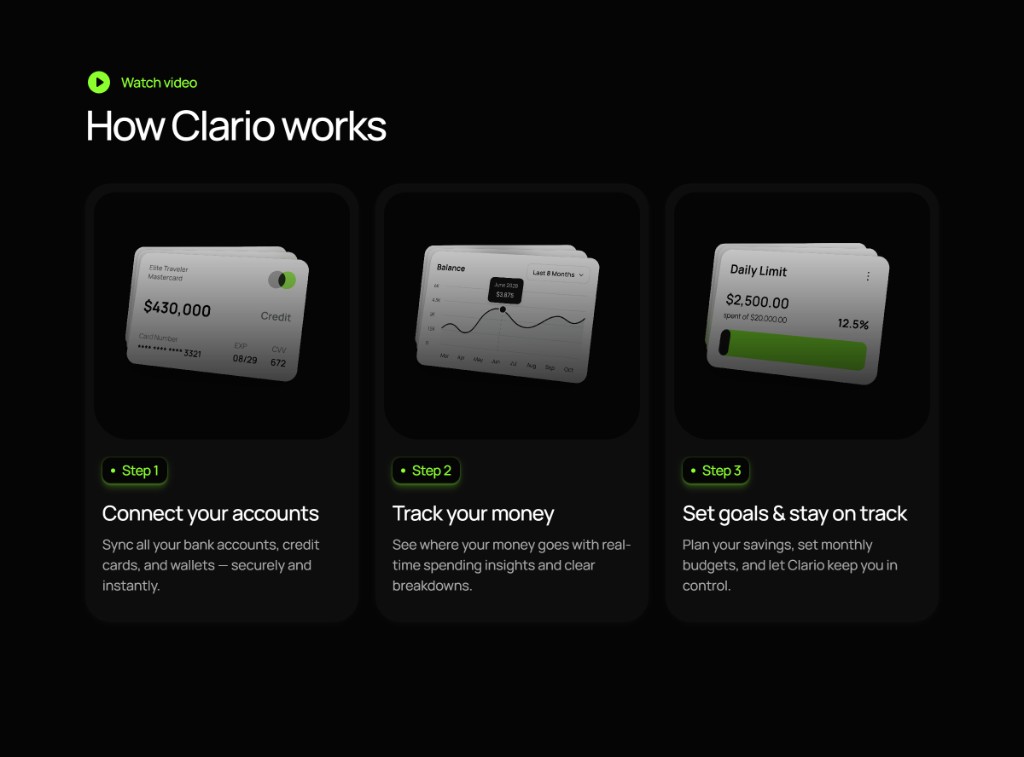
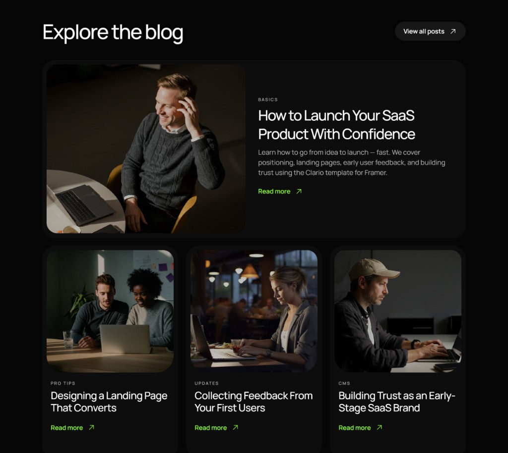
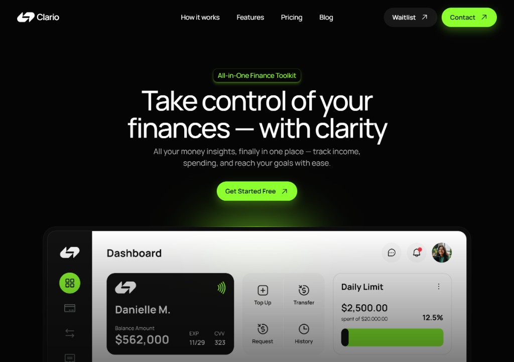
Three key sections from the Clario landing system — hero + dashboard proof, how-it-works steps, and a content-rich blog grid.

Clario hero and dashboard section
Hero Value + proof
Clario how it works section
How it works Step cards
Clario blog grid section
Content Blog + trust

Implementation

The stack
powering it.

A pragmatic mobile stack with AI analysis, real-time data, and a path to shipping fast.

01 / Mobile

React Native
+ Expo

Cross-platform foundations for a native-feel UI, rapid iteration, and smooth navigation patterns.

React NativeExpoTypeScript
02 / AI

Claude API
analysis

Natural-language spend analysis and personalised nudges that explain patterns and suggest next actions.

InsightsNudgesNLP
03 / Data

Supabase
backend

Auth, database, and secure storage for transactions, budgets, and user settings.

PostgresAuthStorage
04 / UX

Designed in
Figma

Full UI/UX designed end-to-end before coding, keeping the product intuitive and mobile-first.

UIDesign systemPrototyping

Need a landing page that feels
premium?

If you're building a product, service, or studio — let's design an identity system that's beautiful, opinionated, and actually usable by the people around you.