Brand Identity · Guidelines · 2026
A precision-built brand system for a product that lives on clarity.
Align needed a visual identity that could carry equal weight across a web dashboard, a mobile app, and print collateral — without losing its edge. I designed a 31-page brand guidelines document that defines the logo, color, typography, and usage rules so every touchpoint feels unmistakably Align.
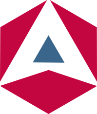
Primary Mark
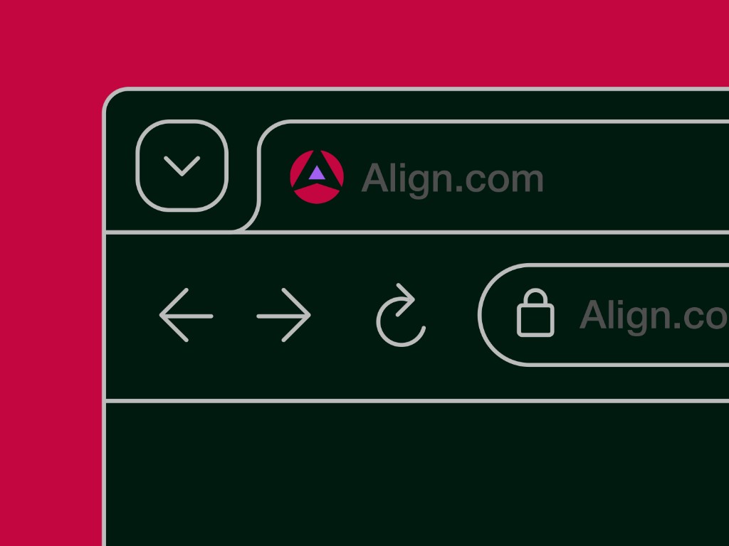
Web Application
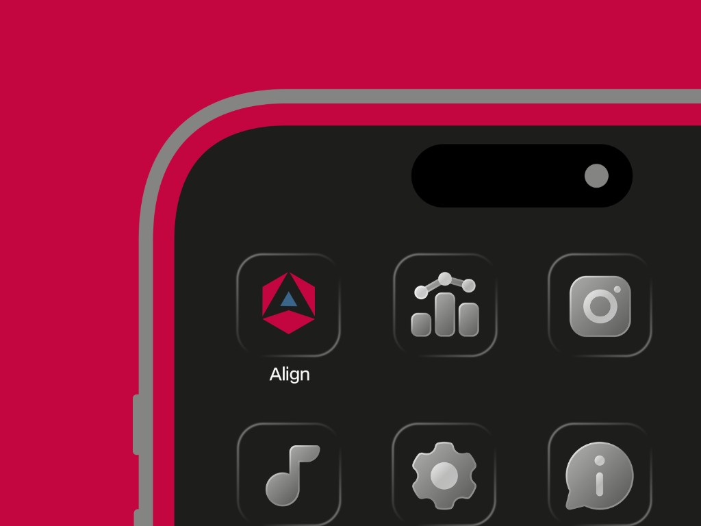
Mobile Identity
The Brief
Align asked for a brand that could scale — from a product icon tucked into a crowded home screen to a full-bleed web hero — without ever losing its signature.
The guidelines document codifies every decision that makes Align recognisable: the construction of the mark, the way it breathes in layouts, the palette's hierarchy, and the typographic rhythm. It's a working reference — a source of truth — not a static showcase.
Designed in Canva, the document is 31 pages of practical rules, do/don't examples, and applied mockups — ready for handoff to any designer, marketer, or developer building for Align.
Inside the System
The guidelines are organised around four pillars — each with clear rules, usage examples, and application notes.
Purpose, personality, and tone. Defines what Align stands for and the voice it speaks with — so messaging stays cohesive across every channel.
Primary and secondary marks, clearspace, minimum sizes, and explicit do/don't examples. Built to stay legible from favicon to billboard.
A deliberate palette led by crimson, anchored with deep ink and soft cream. Type pairings that balance confidence with readability on any surface.
Applied examples across the web experience, the mobile app icon and UI, and social/print collateral — showing the system in the wild.
The Visual Language
The mark is built from a crimson hexagon — a shape that suggests structure and alignment — pierced by a rising blue triangle. It reads as motion, direction, and balance all at once. Works equally at 16px and billboard scale.
Align's palette is anchored by a confident crimson, balanced by deep ink and a soft cream. A deep-green accent adds calm and depth to long-form layouts.
A display serif carries the emotional weight; a clean geometric sans does the work; a mono voice speaks in data and detail.
Applied
Mockups from the guidelines — showing how the identity carries across the web experience and the mobile app.
The Deliverable
Read it in-page, pop it into a new tab, or download for offline use.
If the preview doesn't load in your browser, use Open in new tab above.
If you're building a product, service, or studio — let's design an identity system that's beautiful, opinionated, and actually usable by the people around you.